ice typography by nicole dextras

canadian graphic designer nicole dextras embraces the cold climate of her native country through her ‘ice typography’ installations – a series of larger than life words spelled out in block letters made from ice. the three-dimensional texts are fabricated using moulds
dextras pours water into (sometimes colored for a more dramatic effect), allowing it to freeze and assembling the letters in a means that speaks to how a viewer’s gaze frames and informs the landscape in which the frozen statements are placed.

varying in size from as low as 18 inches in height to a whopping 8 feet tall, regardless of where the texts are installed -whether it is in canada’s northern province of yukon, or the metropolitan city of toronto – it is always the temperature which determines the life of the works, and how long it will take for nature to takes its course and change their state of solid to liquid. as dextras states, ‘this phase of transition becomes symbolic of the interconnectedness of language and culture to the land
as they are affected by time and by a constant shifting and transforming nature
.’

the visual poetry which the designer’s ice typography creates, aims to subvert the authority of the english language and the commerce of signage, selecting words which represent a sense of vulnerability and transition. ‘words cast in ice interrupt our literal narratives, allowing a more integrated reading of the land we inhabit, as opposed to the past and current commodification of land as limitless resource. this fundamental split in perception lies at the crux of our environmental crisis. I therefore choose to create within an ephemeral vernacular to accentuate the collective physical and psychological experience of flux and change,‘ dextras says.

arkitypo

the ‘arkitypo‘ project by london-based design studio johnson banks creates a physical ‘alphabet of alphabets’: a complete set of 3D printed letters, each showcasing the character and history of a particular typeface.

the project is a collaboration with ravensbourne, UK-based digital media university, developed as a means of testing and showcasing the school’s inhouse 3D prototyping technology.

for each of the letters ‘A’ through ‘Z’, the designers selected a typeface beginning with that character, which is used in the sculptural work. each piece furthermore encapsulates a bit of the history of the typeface: the ‘J’ adopts the form of a metro system map, because its fontface ‘johnston’ was originally designed for the london underground; the ‘C’ is composed of ‘courier’, used in 1950s typewriters, and thus is composed of an
assemblage of typewriter keys.

‘arkitypo’ took over six months to complete. johnson banks first researched each letter, and then developed drawings, maquettes, and simple 3D renders before transferring the imagery and ideas to the team at ravensbourne. there, designers further developed the 3D models, collaborating virtually with johnson banks, before beginning the first test prints. some ideas worked immediately; others required refining in order to not fall apart.
the most involved of the letters took as long as eight hours to print.

======= from zvez ========
This is great. Here’s some more info:
• johnson banks was set up by Michael Johnson. He trained in Marketing and Design and set up johnson banks in 1992 after spending his twenties working in London, Sydney, Melbourne and Tokyo.
• Ravensbourne sounds like a for-profit college
• A blogpost with info on each letter:
http://johnsonbanks.co.uk/thoughtfortheweek/ 

Some quotes:
“Some of the ideas worked straight away, some needed refining. Some fell apart, some were perfect…”
http://www.johnsonbanks.co.uk/thoughtfortheweek/index.php?thoughtid=711 accessed 3/4/12, no author listed
=====================
“For each letter we carried out extensive research, made drawings, built maquettes and did simple 3d visuals on our machines, before handing the ideas over to Ravensbourne’s team.”
http://www.johnsonbanks.co.uk/thoughtfortheweek/index.php?thoughtid=711 accessed 3/4/12, no author listed
=====================


Project credits:
Design: johnson banks
Client: Ravensbourne
3d imaging and prototyping: Jon Fidler
Photography: Andy Morgan
Project client: Jill Hogan
Project advisor: Ben Caspersz


W
— Wilhelm Klingspor Gotisch

Rudolf Koch, who designed this font in the 1920s, drew heavily on the shapes and curves learnt during his training as a calligrapher, as he developed this ‘blackletter’ design.

V Verdana
A font specially designed for use on screen: after being bundled into Windows software from the mid-nineties onwards it has become one of the pre-eminent typefaces on the worldwide web.

—Machine
This infamous ITC typeface of the seventies took its inspiration from the American Midwest a century before. Now a classically brutal font perfect for all things industrial, it is interpreted here with a system of interlocking cogs.

==================
This is a great example of graphic design interfacing with technology. These forms would not have been possible without the rapid prototyping machines (3d printers). It’s interesting that the tech facility (college) came to them to test the limits of their machines. This means that technology needs design in order to improve. I also love how there’s the micro and the meta form in these pieces — the tiny, granular letters that make up the larger letterform. This project uses existing and sometimes old-fashioned form in a fresh new way. Finally, I’m struck by the clarity of the method developed by the designers: Take each letter, research a typeface starting with that letter, and go into a back and forth of drawing and printing the sculptural form. This is an illustration of the power of design us to establish processes for cool things to happen. In other words, process is a huge part of design. We design the process as well as the product. Designers can develop processes for interdisciplinary work well.
All this speaks really well to our method chapter.

e-volo personal helicopter

“the ‘e-volo‘ multicopter is a prototype personal transport vehicle, steerable via joystock and powered by sixteen propellers to hover in the air. a team of german professionals– physicist thomas senkel, programmer stephan wolf, and designer philipp halisch, as well as alexander zosel– have just completed the first prototype and test flight of the craft, which they imagine for use towards entertainment purposes, aerial photography and inspection, and short-distance travel.

in ‘e-volo’, altitude, directional control, and balance are automatically managed by onboard computers, while the driver steers by using a simple joystick. the designers note that the program could be integrated with GPS and obstacle detection systems to enable unmanned flight. each of the vehicle’s sixteen motors uses an off-the-shelf battery and is independently controlled, easing maintenance and repairs.

the craft is energy and economically efficient, with a one-hour flight estimated to cost about 6 euros’ worth of electricity. redundancy engineering permits ‘e-volo’ to land safely even if up to four of its motors fail, and the vehicle can also be protected by safety parachute. currently ‘e-volo’ should permit flights of up to 20 minutes, but by integrating a hybrid gas system, or as the capacity of batteries increases, the engineering team suggests that flights could last over an hour.”

=========
The e-volo team
Thomas Senkel developed the concept as a graduate physicist. He did the complete mechanical and electrical construction of the e-volo multicopter. His specialties are research & development of electric drives and ultralight vehicles and aircrafts. He is an enthusiastic paragliding and ultralight pilot.
Stephan Wolf developed the software from scratch, which controls the e-volo’s onboard flight computer. He has more than 25 years of experience developing core drivers and embedded software development in the industry. Alexander Zosel is responsible for marketing, sales, and public relations. He has developed several patents and utility modules and is an avid paragliding pilot and flight instructor.

Thanks to
Philipp Halisch for the design studies. He is a qualified product designer. He studied in Germany, Mexico and Spain, where he realized projects in urban space. He investigated the needs and practicability of an electrically-operated multicopter as an urban means of transportation.

interactive car windows by GM + bezalel future lab

“with the ‘windows of opportunity’ (‘WOO’) project, GM collaborated with students in the ‘future lab’ masters course at bezalel academy of arts and design in jerusalem to transform car windows into interactive displays. the project’s focus is primarily on enriching
the experience of backseat passengers.

the bezalel design students produced full scale functional prototypes of a rear passenger seat and side windows, using ‘eyeclick‘ motion and optical sensor technology to transform the glass into an interactive surface on which they featured their game designs.

the concepts are not planned for immediate production, but four application designs offer users  glimpse of what this technology may be used towards in the future.”

Wayne White

“My mission is to bring humor into fine art” 

“I want to take this painting idea and see if I can do a puppet version of it. I want to take cartooning and turn it into a set. I want to take a set and turn it back into a painting.”

“Do what you love. It’s going to lead to where you want to go.”
— All three quotes by Wayne White, from the trailer to “Beauty is Embarrasing”
http://www.youtube.com/watch?feature=player_embedded&v=xQsN1zhRUjU#!  

waynewhiteart.com
Link to his monograph by Todd Oldham, on Amazon
Another example of a fluid thinker, like Andrew Byrom, is Wayne White, a puppeteer, art director, illustrator, painter and sculptor. He’s been a production designer (?) for Pee Wee’s Playhouse, and has designed videos for Peter Gabriel and the Smashing Pumpkins. I’m drawn to how he works with type, particularly how easily he works in both two and three dimensions. For example, “The Sound of Cutting Slack” is executed both as a sculpture and a painting.

When White fuses monumental lettering and thrift store painting, he creates a new idea and hence pushes both disciplines further. Sure, his precedents are Ed Ruscha and Jim Shaw, but I don’t think Ruscha embraced the figurative the same way, while Shaw doesn’t share White’s lettering skill. White did this for the 2000 cover of Lambchop’s album, Nixon, as well as in many other paintings of his.


prada 24-hour pop-up museum

designed by italian artist francesco vezzoli with AMO (the think tank of dutch architect rem koolhaas’s OMA studio), the prada ’24 h museum’ opens tonight in paris’s historic palais d’iéna, now the seat of paris’s economic, social and environmental council. the gallery space exists for only twenty-four hours– first as a private party, then at 11pm CET as a discotheque viewable online at the ‘24 h museum‘ website, and then finally as an exhibition open to the public and school tours during the day of january 25th.

the installation is divided into three sections, each modeled after a particular type of museum space: historic, contemporary, and ‘forgotten’, all offering tribute to femininity through five-meter high, neoclassical sculptures that reference contemporary celebrities– ‘disco sculptures’ as he calls them. the classical space is framed by the curving stairway of the palace; the experimental area set in a cage surrounding the main hall, illuminated by pink neon; and the third, the ‘storage or salon de refusés’, modeled after abandoned museums and warehouses. in this way, the installation becomes a meta-museum, examining the ways in which art is presented and consumed. the ’24 h museum’ party is also reported to include amongs its events a twitter conversation between vezzoli and an unnamed celebrity.

noting the importance of context when discussing cultural concerns, vezzoli reflects: ‘artists and critics see museums as a jewel case where the mementos of our epoch should be preserved, but if you said ‘MoMA’ to the president of barclays bank, [he would] say, ‘that’s a venue for rent for ,000 if you want to hold an event.

Craig & Karl


These guys are great, but I sense they’re both very much graphic designers. What we really need are collaborators where one is a gd, and the other from another discipline.
 

This logo illustrates collaboration between two people really nicely.
Craig and Karl are co-founders of the Australian design collective Rinzen.
craig & karl
 

craig redman and karl maier live on opposite sides of the world but collaborate daily to create bold work that is filled with simple messages executed in a thoughtful and often humorous way. they specialize in illustration, installation, typography, as well as character, editorial and pattern design.

craig & karl have exhibited across the world, most notably at the musée de la publicité, louvre. they have worked on projects for clients like lvmh, google, nike, apple, vogue, microsoft, converse, MTV and the new york times.

craig is the creator of the blog darcel disappoints, often working in collaboration with iconic parisian store colette and in 2010 he opened a solo exhibition there, titled ‘and a miserable day to you too’.

the objective of the project was to breathe new life into the space which, having been rendered in concrete with little inlet of natural light, felt quite dark and heavy. working closely with the owners, who possess a keen design sensibility, it was decided that the mural would cover all surfaces in a blanket of bright color. there was also a request that the larger wall surfaces be left blank with an eye towards potentially introducing additional, individually commissioned works at a future date. nevertheless it was vital that the installation feel and function as a complete work in its own right. the resulting design is a dynamic mix of overlapping geometric forms that mirror
and respond to the angularity of the architecture. the whole piece is tied together by a winding, ribbon-style device which, acting as a central axis, leads in from the driveway, through the space and out to the garden beyond
.’ – craig & karl

An immersive mural for a private residence car park in Sydney, Australia. Mural installation by Edward Woodley. Photo: Katherine Lu.


A mural for Bikes 4 Humanity, an organization that collects pre-loved bikes for donation to communities in Africa. The mural was commissioned by Lend Lease for a collection depot they set up at the Barangaroo site in Sydney. It was also painted in large part by Lend Lease employees. This project was facilitated by Gallery A.S.


Sculpture of film director Michelangelo Antonioni, installed in the Castle Estense Ferrara, the city of Antonioni’s birth. Thanks to Slam Jam for making it possible.

Reworking an image from Singaporean gallery Vue Privée’s collection of 19th century Japanese photography for their ‘Technicolour Japan’ exhibition.

An exhibition of the two, titled Pick Me Up, of works done over email, Monster Children gallery, 20 Burton Street, Darlinghurst, New South Wales, June/July 2010.  “The show is the result of a year-long visual conversation between the two of us,” explains Maier. “Weekly, we traded artwork via email that served as both an update on each other’s lives and a commentary on the different, yet similar, worlds around us. The 14 resulting works are rife with double entendres, often including plays on words or forms, and the pieces provide a happy disjuncture between what is meant and what is perceived.” Quote from this site.

Electroland

collaboration beween Camron Mcnall and Damon Seeley

Create interactive environments which use layers of technology to intelligently register the movement of pedestrians through public spaces.

At the time of posting couldn’t get their website to work – http://electroland.net/

=======Added by Zvez========
Electroland is a team that creates objects, interactive experiences and large-scale public art projects. Damon Seeley co-founded Electroland in 2002. He holds a degree in Design and Media Arts from UCLA, and has fulfilled various roles as an art director, interaction designer, technical director and project manager for design and media-arts projects. Cameron McNall is an Architect and Artist. He received a Master of Architecture from the Harvard University Graduate School of Design in 1985 and a Bachelor of Arts degree in Design from UCLA in 1978. He co-founded the design collaborative Electroland in 2002.


Drive By. A 73 meter electronic display that tracks passing cars and alternates between two modes: alphanumeric letters that read out famous lines from Hollywood films and abstract letterforms that follow cars as they pass by. Completed 2007


Author Wall. Interactive touchscreen interface, Guadalajara Book Fair, 2009. Visitors manipulate a floating cloud of 200 author names, projected on a 30-meter wall. This is a great example of gd-driven interdisciplinarity.

 
R-G-B ant SCI-Arc, 2001. Three month installation.
Colored lights fill 81 windows, extending over 180 meters at SCI-Arc. Light animations are commanded by cell phone keypad combinations. Anyone could call in and control part of the animation. This project questioned private interaction and control of public spaces.

Colllege Faces. Gateway Community College, New Haven, Connecticut. Year??
The faces of all students, faculty and administators, projected huge, in slow motion. Builds a sense of community, stands in contrast to the “pseudo-tudor” architecture of nearby Yale college. Individual faces can be accessed via smartphone or website.  Another

notes from triennial

DESIGN CULTURE NOW, national design triennial

accelerated change

A designer is an emerging synthesis of artist, inventor, mechanic, objective economist, and evolutionary strategist.” R. Buckminster Fuller

“The US, like other nations of the world, faces many social, economic, and environmental problems. As people trained to bridge the gam between technology, science, art , and the humanities, designers are in a unique poison to be a powerful force for positive change.” Diane Pilgrim

“In collage, discrete elements remain visually distinct. The juxtaposition and overlap of individual parts spur fresh insight. Mutations fuse discrete elements into new entities. In the process of becoming something else forms meld to assume identities that bear few traces of their constituent parts. Mutations are a gens of change; their transformations suggest latent possibilities.” Donald Albrecht

“Enormous opportunities for the design profession are being driven by the possibility  to meaningfully combine features, objects, materials, technologies, and ideas previously considered to be separate. THere are more unions of content and commerce than at any other point in history…As combinatory thing becomes the new norm, design –an intrinsically hybrid practice merging the conflicting needs of art, business, and engineering–will be on tis way toward total infiltration of human environments.” Steven Skov Holt

“A designer is an emerging synthesis of artist, inventor, mechanic, objective economist, and evolutionary strategist.” R. Buckminster Fuller

“Biomimicry, a term often used in conjunction with design, represents a form of reverse engineering, with designers studying and copying the appearance and forms of natural organisms in offer to reproduce various processes and functions. The Nike Free Shoe, for example resulted when a group o Nike designers spent time exploring the physiognomy of the human food and sketching and studying the natural movements of animals.” Barbara J. Bloemink


DESIGN LIFE NOW, national design triennial

Pixar? pg 012

robots? 016

Seattle Central Library pg 022

music industry- mash up music, Girl Talk

Chapter — Method_003

The only new section is UNDER the dashed rule, titled “That Can’t Be Done. Can It?”

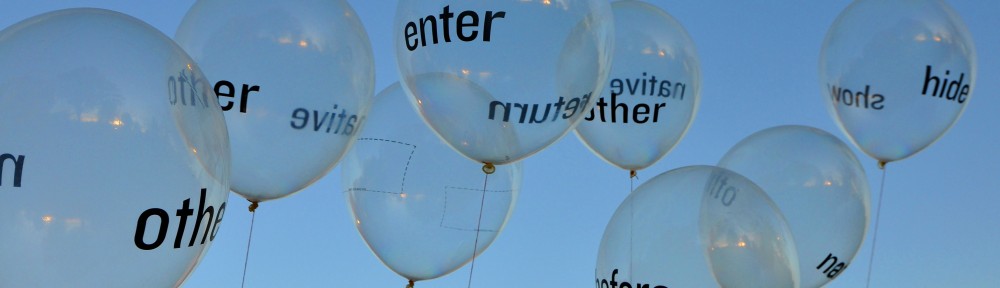
INTERDISCIPLINARY METHOD

We live in a compartmentalized mind frame. Home is different from office, fun is separated from work, science lives apart from art. We’ve been trained to specialize in one thing and call that our profession, pushing our other interests down to lesser importance. Many of us, however, have several seemingly unrelated passions simmering within us, waiting to be manifested with the right method.

Interdisciplinary thinking turns compartmentalization on its head by encouraging the coming together of disparate interests. As designers, we are schooled to develop techniques and apply them to content in order to make form. What if techniques and content stem from radically different fields? In her map painting series, designer Paula Scher, partner in the eminent studio, Pentagram, combined her passion for lettering, maps and painting to create a series cross-disciplinary works. Similarly, designer Andrew Byrom merged his love of typography and furniture to create typographic furniture, while the ceramicist Stephanie Dearmond cast letterforms in porcelain to make new and unexpected form. These are but a few examples of what can happen when we choose to combine our interests instead of segregating them.

Passions are fluid. They change shape and intensity. Introduce yourself to a new subject matter. Prod into a new discipline in order to give yourself a new perspective. Conversations fuel passions and can lead to new ways of thinking. This is precisely why designer James Victore holds The Dinner Series, an annual week-long workshop where each day culminates in a lavish dinner party, meant to stimulate creative conversation. (Get Victore quote here).

Give another example of stimulating conversation here. 

Conversations can lead to striking collaborations between experts from different fields. Longtime collaborators  Michael Amzalag and Mathias Augustyniak of MM/Paris and photographers Inez van Lamsweerde and Vinoodh Matadin have produced hybrid photo/text works. (Show alphabet here). Likewise, designer Stephen Farrell has worked closely with writer Steve Tomasula to publish novels that bestow equal value on the design and the text. (Need example of designer working with a no-artistic collaborator). 

Add a paragraph on working with community — larger, social issues

How does this work get done? In this chapter, we give you some leads. We attempt here to break down the method of interdsiciplinary design into useful tools—charts and diagrams, tips on inter-personal relations, and tips for testing the work as you go along.

=====================
That Can’t Be Done. Can It?
Most of us have pulled the cord to flip venetian blinds open or closed hundreds of times, without giving it a second thought. But to designer Andrew Byrom, this commonplace instance led to a burst of inspiration, as he envisioned letterforms made of blinds, switching from bold to regular to light with the pull of the cord. This notion has led him to build a series of letters out of venetian blinds, and further, to draw a striking flat typeface based on the idea of the window blind. (show images)

Byrom thinks in an unrestricted way, seeing the magical in the mundane by asking “what if?” His thoughts move fluidly from paper to screen, to metal work, kite construction and neon signage. In doing so, he constantly subverts existing parameters and pushes his way into other disciplines to nourish his creative needs. Byrom’s thinking is effective only because it is backed up by his eagerness to learn, to renounce the comfort of his mastery to for the thorny work of the beginner, failing again and again until a new skill has been learned.

Fluid thinking allows us to see old things in a new way. Find inspiration and possibilities by combining existing knowledge in unexpected ways. Apply an old process to a new material, or inversely, a new process to a well-known material. And when you move from thinking to making, expect obstacles and find ways to overcome them. Experts will insist that it cannot be done, but if you trust your idea and show both your passion and persistence, they may eventually move over to your side and share skills with you. When the level of investment is high, interdisciplinary work comes alive.