Para Clock

concrete, tradition, geometry, participatory

We love to make things, and we really want to make beautiful wall clocks.

Para-Clocks is about:

  • Combining digital design methods with traditional craft using concrete
  • And most importantly, involving YOU in the design process!

Inspiration

We were first inspired by radial geometry and symmetry found in architecture and textiles from every culture around the world. Certain patterns from these cultures can be boiled down to a simple set of steps and rules for making them. Designing using parametric software allows us to create many variations of radial patterns based off of similar sets of rules; but these are then played with and manipulated, allowing each pattern to be expressive in surprising ways.

watch the kickstarter campaign at: http://www.kickstarter.com/projects/224392735/para-clocks-project

poster, chair?

http://www.designboom.com/weblog/cat/10/view/19771/sebastian-errazuriz-occupy-chairs-the-armory-show-2012.html

sebastian errazuriz has developed the art-furniture collection ‘occupy chairs’. the series consists of twelve chairs formed from plywood, decorated by white acrylic paint and a replica of one of several signs used by protesters in the occupy wall street movement,
written in black paint upon the surface of the flattened folding chairs. the artist created the pieces as dual protest sign/seating implements.

when not in use, the message of the protester may be read on the surface of the object and while secured in chair form, the piece may serve protesters to better occupy public spaces. additionally, the series was created with the chilean-born artist’s vision to occupy the homes of the 1% with the message of the 99%. errazuriz believes this effort will be achieved through the action of the collectors, being typically of the 1%, purchasing a piece from the collection. this choice to purchase this art work would bring the sentiments of the protesters into the homesof the 1%. in this way, the art buyers would monetarily support the efforts of the masses and, by default, would share the message of the protesters with other members of this socioeconomic class.

as a double-sided mirror the occupy chairs also explore the potential for these complaints against the richest one percent to be transformed into
glamorous fashionable catch phrases in design-art pieces that celebrate the exclusive luxury market.
‘ – sebastian errazuriz

ruslan khasanov: making of sunbeam type

another example we could use in the last chapter. Follow the link to see them in motion.

http://www.designboom.com/weblog/cat/10/view/20136/ruslan-khasanov-making-of-sunbeam-type.html

khasanov, based in ekaterinburg, russia,
has developed an entirely sunlight-formed typeface, shaped through the dispersion of light. this phenomenon is most commonly observed in the occurrence
of a rainbow, displaying the spatial separation of white light into the differing wavelengths– resulting in a notable variation in color.

in order to harness this light effect, khasanov first experimented with glass and mirrors as he added water to these reflective media in an effort to create
the glittered, rainbow alphabet. in the initial ‘sunbeamtype’ explorations, the designer achieved interesting effects, although he realized he had not quite tapped into
the potential for what he had envisioned as a radiant, sunbeam typeface. khasanov tells designboom, ‘I thought of the light dispersion phenomenon (the splitting of the
white light into a rainbow). all I needed was to deflect the light by transparent refracting mediums. I’ve used gel by dabbing on a glass and then I draw
the letters on with a clean brush. all I had to do was to bring that glass to the sunbeam and to reflect letters by a lens on the background.’ 
by re-determining
the angle and a distance from which the digital camera was positioned to the piece of glass with gel-scrawled type, the designer was able to achieve a fascinating
trick of light. it was due to this subtle shift in materials and method that the designer was able to document his sun-formed font.


Eric Ku: chair/chair

From “Now in Production” at the Walker Art Center.
from the Walker blog:
http://blogs.walkerart.org/design/2011/10/26/gdnip-3-konstantin-grcic-eric-ku-chair-design/ 

Eric Ku’s Chair/Chair.

In the Gallery…

Ku’s Chair/Chair in the typography section of the exhibition.

From the gallery label… Eric Ku’s Chair is made from pieces that when taken apart, spell out the word “chair.” Ku was inspired by a famous work by conceptual artist Joseph Kosuth, One and Three Chairs(1965). Kosuth placed a real chair in the gallery next to a photograph of the same chair (photographed in that gallery) and a definition from a dictionary.

Joseph Kosuth, One and Three Chairs (1965).

Design Convos at Dcenter Baltimore

glad to be of help! (all text credit goes to fred).

On Wed, Mar 21, 2012 at 3:53 PM, Sarah Doherty <sdoherty@mica.edu> wrote:

hello zvezdana-
glad of your interest in the d center design convos! they have been really wonderful!

i passed your questions on to some of my fellow board members, especially fred scharmen who is one of the principal coordinators of the events. see his responses below which echo my own thoughts as well.

let me know if you need or want more info and or responses!

best-

sarah

———- Forwarded message ———-

From: Fred Scharmen <sevensixfive@gmail.com>

Date: Tue, Mar 20, 2012 at 12:12 PM

Subject: Re: design convo’s – book publication

To: Sarah Doherty <sdoherty@mica.edu>

Cc: Klaus Philipsen <kphilipsen@archplan.com>, Brian Oster <boster@cbhassociates.com>, Ben Stone <ben.stone@gmail.com>, Marian <marian.glebes@gmail.com>

I can take a pass at answering some of these questions.

What would you say has been the main purpose of Design Convos?

When we started them, we weren’t really sure what the main purpose would turn out to be, other than to provide a venue for presenting and thinking about design work in the city (with both “design work” and “the city” defined in the broadest possible sense here). The thing that’s kind of become the main purpose is this – it’s been a very effective way to link up people and work that might otherwise not have gotten linked up. People might come in thinking that what they do is not relevant to a design context, or they think that others in different contexts won’t be able to relate to it, and they leave with hopefully a broader perspective and some new potential friends and collaborators.

In what way have they helped interdisciplinary efforts? 

These Conversations have put artists in the same room with developers, teachers in the same room with activists, politicians in the same room with architects, engineers together with community organizers … the list could go on and on. In the best cases, each discipline is able to absorb a little bit of what the constraints and opportunities are in other disciplines, from the point of view of the people inside them, and hopefully, each discipline is able to recognize that there are a lot of interesting resonances and productive differences in the spaces between what they do.

And could you name two or three concrete things that came out of them? For example, an exhibition, project, etc.

Sure, there’s Gary Kachadourian’s Baltimore Infill Survey: http://www.flickr.com/photos/baltimoreinfillsurvey/ , that came out of a Conversation on Vacancy that Gary hosted. There were a few articles written about it, and it got entries from all over the world via flickr. I think Sarah Doherty’s Access Alley project got a new level of interdisciplinary interest when it was presented at an early Design Convo, too.( http://www.axisalley.wordpress.com )  Eric Leshinsky’s notion of ‘cultural containers’ which was the subject of a convo he hosted, has helped focus some of my own thoughts as a spatial practitioner, I’ve expanded his thoughts in a few published articles. We’ve helped push the visibility of people doing interesting work in Baltimore, in everything from street art to bio-remediation, and after showing their work in our venue, they’ve gone on to do even bigger and greater things – kind of the ‘cultural container’ principle at work.

What we’ve been most of proud of, though, is this ability to make introductions and connections between people and practices. Many collaborations have been realized after people have exchanged email addresses during design conversations, with projects realized at festivals like Artscape and Transmodern, even architectural commissions growing from meetings here. These are harder to quantify, but in some ways even more ‘concrete’ than anything. My favorite story about a concrete outcome is the fact that I met my girlfriend Marian, also a cofounder of Dcenter and a Design Convo co-conspirator, at an early Design Conversation. ;D


everyone should go to art school

Thomas Kovachevich is both a physician and an artist. He’s practicing both his professions in NYC and has a show there right now.
http://www.nytimes.com/2012/03/23/arts/design/thomas-kovachevich-alpenglow.html?ref=arts
Here’s a video clip where he says that “everyone should go to arts school first, to learn how to solve problems, and then go and study whatever their chosen profession is.” Take a listen! (yay, I finally learned how to post videos, thanks nance)

wandering territory

“Nestled in that no man’s land, a new era with new work is being prepared; artistic and elastic statements that without a doubt are shifting between all disciplines and all dimensions.”

The Pop-Up Generation
Design Between Dimensions
By Lidewij Edelkoort

13 December 2011 – 12 April 2012

the exhibition ‘the pop-up generation: design between dimensions’, investigates the trends of screen culture, flat-packing, and pop-up shops
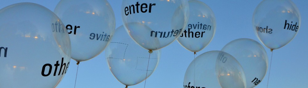
by graphic designer anna garforth, in collaboration with vinke display

process video (really great!)

http://vimeo.com/36152966

http://www.motimuseum.nl/en/exhibitions/current/the-pop-up-generation/855

“In 2010, the Japanese fashion designer Issey Miyake first presented a ground-breaking collection called 132 5. Working closely with a computer scientist, mathematical algorithms were designed into 3D shapes that are then heat-pressed into two-dimensional forms. When these garments are folded, they resemble origami creations. When they are unfolded and put on, dimensional shapes pop-out and protrude from the body.”

“Young generations born with and behind the screen live in a shadow area, a no man’s land between the second and third dimension that they wish to connect. This popup generation moves easily from 2D to 3D and back again as if they do not even notice that there is a difference. The brain is trained to see volume in a flat sketch and to discover a structure behind the volume found in an architectonic drawing.”

Hit the jackpot- so many interesting projects. I’ll add more later
===========ZVEZ=======3/27/12=======
Sadly, I cannot find a graphic designer on the list of participants here. I think it’s important to keep gd as the core from which we’re writing.

from the MOTI museum website (Museum of the Image in Breda)

“Armed with technological developments, today’s designers are now able to allow themselves to be unrestricted by dimensions”

“At the start of the 21st century, the world is a cacophony of different cultures, destitute economies, innovative mass media and hyper technology. Old structures disappear and are replaced by a longing for synergy that flourishes with the new worldwide means of communication. In the practice of design, disciplines merge and worlds are linked together; 2D & 3D, analogue & digital, culture & capital, science & art, nature & technology and local & global.”

Participating designers:
Kiki van Eijk (NL), Catharina van Eetvelde (BE), Rodrigo Solorzano (MEX), Anthony Kleinepier (NL), Tord Boontje (NL), Bartosz Mucha (PL), Jaime Hayon (SP), Studio Job (NL), Niels Meulman (NL), Anna Garforth (GB), Carla Fernandez, Niels Hoebers (NL) Eric Ku (USA), Camile Scherrer (CH), Eley Kishimoto (JP), Carolina Wilcke (BE), Issey Miyake (JP), Laurens Manders (NL), Front (SE), Molo (CA), Richard Woods (GB) and Neozoon.


Kiki van Eijk (NL) — furniture design
Catharina van Eetvelde (BE) — animator/artist
Rodrigo Solorzano (MEX) — industrial design, origami type stuff, interesting diy toy kit for kids
Anthony Kleinepier (NL)
Tord Boontje (NL)
Bartosz Mucha (PL)
Jaime Hayon (SP)
Studio Job (NL)
Niels Meulman (NL)
Anna Garforth (GB
Carla Fernandez, Niels Hoebers (NL)
Eric Ku (USA) — graphic designer!!!
Camile Scherrer (CH)
Eley Kishimoto (JP)
Carolina Wilcke (BE) — product designer
Issey Miyake (JP)
Laurens Manders (NL)
Front (SE)
Molo (CA) — canadian architects and product designers
Richard Woods (GB) — british sculptor, fake surfaces
Neozoon.


method chapter: messages

  1. Make conversation (victore, d:center, etsy, social media)
  2. Ask “what if?” questions (byrom)
  3. Oppose yourself: do something opposite your norm (electroland)
  4. Apply a new method (type fluid and arkiypo, dearmond)
  5. Clarify your vision (bjork)
  6. Make yourself understood. Speak clearly, use simple language (bjork, ideo)
  7. Funny is good (bjork)
  8. Master gd basics (mm paris)
  9. Cultivate respect (mm paris)
  10. Apply graphics to unusual places (scarves, furniture) (mm paris, mike perry, joshua davis)
  11. Observe and listen (active listener) (ideo, froehlich, poggio)
  12. Build empathy (ideo, froehlich)
  13. Immerse yourself (froehlich, poggio)
  14. Question everything (project masilueke)
  15. Customize your process (project masilueke)